
Usually.
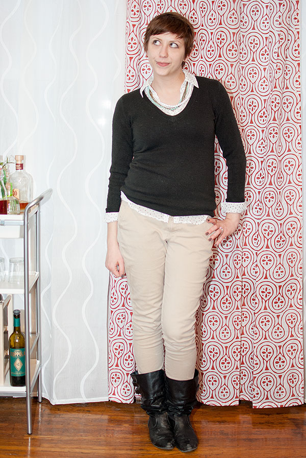

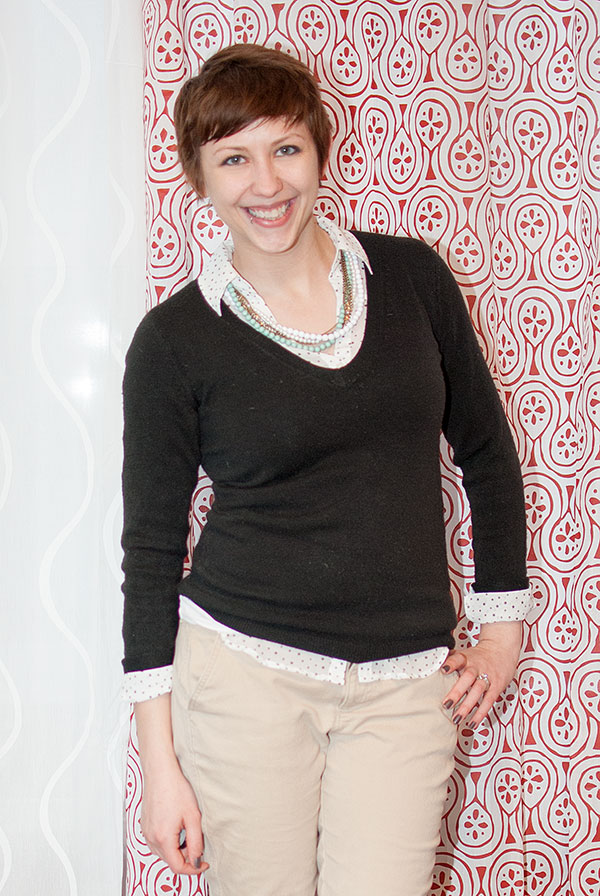
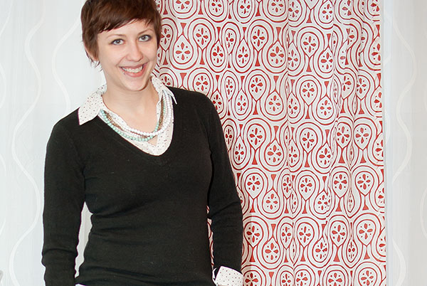
sweater: New York & Company
blouse: Express via Discount Fashion Warehouse
khaki skinnies: Old Navy
boots: Target
necklace: Jane.com
Sometimes, it's kind of nice to go back to my roots, so to speak. Though even this outfit is a far cry from the black shirt/khaki pants combo I would have been wearing three years ago, when I first started brainstorming the idea of a style blog. The pearls! The stars-as-polka-dots sheer blouse! The layering! The khakis-as-skinnies-tucked-into-boots! I would have worn none of it, I tell you.
Except the sweater. That baby was purchased nearly three and a half years ago, when I first entered the professional world and needed a business casual wardrobe, stat. New York & Company, you've done well for me.
Oh, and if that last photo looks different, it's because it is. Slightly. I played around with sharpening the image in Photoshop's RAW editing mode before using the sharpening actions I've mentioned before. (My original post on sharpening photos is pretty poor; it's little more than a link to these three pages. I'm going to do some more research on sharpening in the RAW editor, then I'll come back and do a comprehensive post on the whole shebang. So...stay tuned!
So cute! Love the boots.
ReplyDeleteI tend to wear a lot of neutrals in general and have really used my blog to try to expand my horizons a little. Love this look on you though!
ReplyDeleteMiche from Buttons and Birdcages