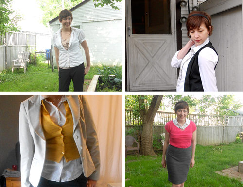
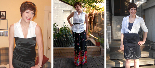
Howdy y'all. Today I'm linking up to Audrey's One Piece Many Ways link-up over on Putting Me Together. If you've followed this blog for any amount of time, you've probably noticed that some pieces tend to appear and reappear around here. That's because remixing = awesome and it's the best way to pretend that your wardrobe is bigger than it really is, I think :)
For today's link-up, I'm featuring a plain white button-down-style shirt. To be fair, I'm kind of cheating here and using four different styles of button-down: a sleeveless, a short-sleeve, a short-sleeve with polka dots and a long-sleeve. Honestly, if you have those four pieces in your closet (or three, if you wanna nix the polka dots), you can create about a billion different outfits. Give or take. Here are my favorite ways to wear these:
As a plain ol' shirt
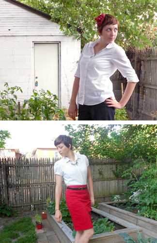
(original post: top, bottom)
Layered
(original post: top left, top right, bottom left, bottom right)
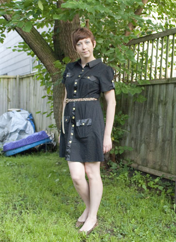
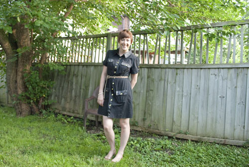
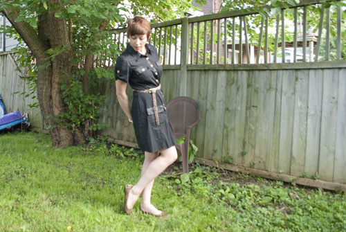
Layered...with a dress (yes, it's very different)
(original post: left, middle, right)
So yeah. One (type of) piece, nine ways to style it. I'm telling you, if you don't have a white button-down shirt in these three sleeve lengths, run (don't walk) out and get them now! I'm actually working on my color collection, too...I have a short-sleeve in a few colors, a sleeveless in black and a long-sleeve in a couple colors. Need...more...button-downs...
Okay, y'all. I have something very, very important question to ask: Where tha HECK can I find a shirt like this??
No lie, I've been searching for the perfect tie-front blouse for-EVER. Today I saw this shirt on Putting Me Together and just about leap out of my chair in my haste to click through the link and buy it. But ModCloth is sold out of it! Cue devastation.
So maybe I'm being a bit dramatic. I don't care. I'm a bit heartbroken. So I'm turning to crowdsourcing: Has anyone seen a similarly cute tie-front blouse? (Birds optional.) Also, feel free to tell me that I'm not alone for freaking out over a stupid shirt ;)
Woah, woah, woah. It's the last Friday in July already? What the what? (Insert other weird expression of disbelief here.)
Well apparently it is; as they say, time and tide wait for no man. This month was hella expensive for me, between trips and replacing my lost stuff (and possibly upgrading to the nicer Macbook because I deserve it, damnit even though it costed me way more out-of-pocket) and having to replace the brake pads and rotors on all four wheels of my car and a host of other things I couldn't begin to name right now. Fortunately, I was at least able to stick pretty close to my $50 clothes budget for this month. (My budget usually is $100 but I cut it back a bit given everything else that's happening.) Each of these items were inspired by someone or something else, which is pretty interesting I think. I topped out at $54.06, so I call that a success :) Here's what I got:
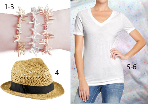 1-3. Bracelets from Sage K and Co. on Etsy. A friend of mine posted these on Instagram and I fell in love...she was kind enough to share the link with me, and I bought them immediately. I got one in each color using a combo deal that's no longer available. You can still buy them individually for $10.99 a pop, though. $27.43 total |exact|
4. H&M hat. I saw Whitney wear a hat like this in a recent post and she made it look so cute, I just had to give the look a shot. I wore it out last weekend...post to come ;) $9.95 |exact|
5-6. I needed a plain white t-shirt for the Color Run, so I picked this up at Old Navy. There was a buy-two-get-a-lower-price deal, so I got another one in the pattern layered underneath. The tiny confetti spots of color were a bit Color Run-esque, I thought, only more toned down. $15 for both |exact (white and other colors but not confetti)|
So yeah, a nice little haul I think. I'm never sure how to wrap these posts up, so...potato? Have a great weekend, y'all.
Hi all! So today I'm doing something kind of new to Verbal Mélange. It's a photography tutorial, specifically a Photoshop one. I mentioned the other day that I'd do a tutorial for lightening blown-out windows when shooting interiors, but I got a little feedback from a bloggy friend saying she hadn't worked in Photoshop Layers much...so I thought I'd start with the basics.
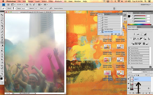
So. Here we go. For this tutorial, I'm working with a photo from the Color Run last weekend. Emily shot it with her iPhone (or maybe I did? I'm not sure), through a plastic bag. It was overcast, and the bag desaturated the color quite a bit, so it was a pretty dreary shot. Here's the before and after:
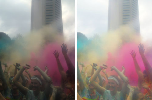 As a disclaimer, I'm using CS4 for my edits. If you're running a different version, commands might vary slightly...but it shouldn't be too off. Anyway. To start, I opened up the image (a JPEG) in Photoshop. The first thing I did (and the first think you should always do) is create a new layer of the original image with Command+J (or by right-clicking the layer in the Layers window and selecting "create duplicate layer"). That way, if you reeeeeeally screw something up, you always have the original handy.
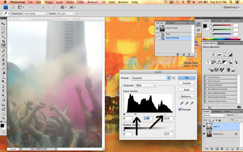
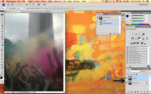 Next, I made sure the new duplicate layer was selected by clicking it in the Layers window. The selected layer is highlighted blue in the window, as you can see in the above photo. I opened the Levels editor (Command+L or Image>Adjustments>Levels in the menu bar) and tweaked those. I bumped up the white (the slider on the far right) a tad to brighten the whole image, then bumped up the midtones (the middle slider) quite a bit to adjust the grays in the image.
 Next, I opened the Hue/Saturation editor (Command+U or Image>Adjustments>Hue/Saturation). I left the hue alone, but increased the saturation to brighten all the colors.
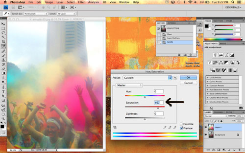
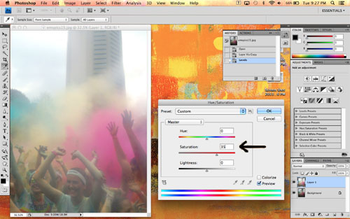 Be careful not to overdo it on the saturation here. We'll adjust the color clouds individually in a bit. If you go overboard on saturation, your skintones will look like this:
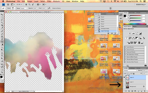
 Next I used the Magic Wand tool (shown in the toolbar on the left, or just type "w" on your keyboard) to select the color clouds. Make sure you use the "add to selection" function along the top, so each click adds to the selected area instead of changing it. If the wand is grabbing too much space and selecting things you don't want, try adjusting the tolerance (also at the top) down a bit.
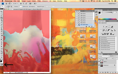
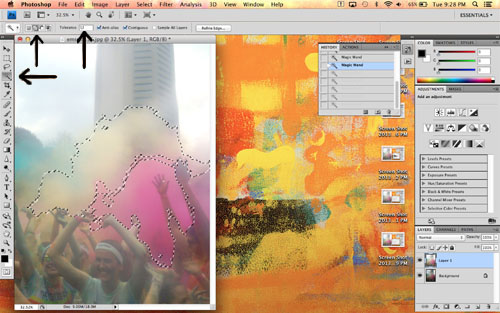 I selected all the color clouds, and realized that I had some of the peoples' hands/faces selected as well. De-selecting them with the Magic Wand would have taken forever, so I entered Quick Mask mode by clicking the circle-within-a-rectangle button on the bottom of the toolbar at the left. Quick Mask turns the not-selected areas of your photo red. You can then go in with an eraser and paintbrush to fine-tune your selection.
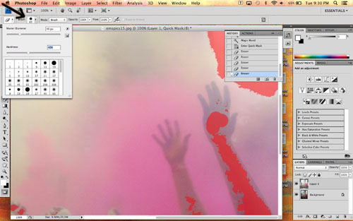
 I adjusted the size of the eraser as needed using the drop-down menus at the top (you can also right-click to pull up the drop-down menus wherever your cursor is), and erased all the people out of my selection. I didn't worry too much about being perfect, because everything is so colorful a few little bits here and there wouldn't show up.
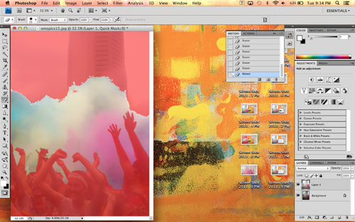
 When I was done, my finished Quick Mask looked like this. See how only the color clouds are selected?
 I turned off Quick Mask by clicking the same button again, and used Command+J to create a new layer that includes only the selected color clouds. You can see it in the Layers window here:
 If you click the eyeballs next to each layer, you can hide them. I did that here to show you just the color-clouds-only layer:
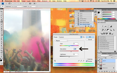
 Then I un-hid the other layers and re-opened the Hue/Saturation editor. I bumped up the saturation on the color clouds layer even more so it would look the way it did at the actual run. (Okay, maybe the color is a little more intense. I couldn't help myself, hehe.)
 Finally, to keep the image from looking too cartoonish, I adjusted the opacity of the color cloud layer. This helps to blend the rest of the edited layer and the color cloud layer by allowing a little of the edited layer to show through. I just adjusted the slider until it looked right.
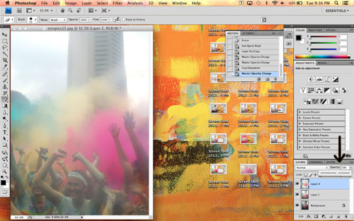 A note on layers: The order they appear in the Layers window is the order they're stacked in the viewer. So my original, unedited layer is at the bottom of the list and is therefore completely hidden, because the edited layer is overtop it with 100% opacity. The color cloud layer has a lower opacity, so although it covers the edited layer, a little bit is allowed to show through. Does that make sense?
So there you have it! A pretty easy process, despite all the words you see above ;)
Now, does all that make sense to you guys? Sometimes I'm pretty bad at explaining procedural things like that. Let me know what you thought of this tutorial in the comments, please and thank you!
A note on layers: The order they appear in the Layers window is the order they're stacked in the viewer. So my original, unedited layer is at the bottom of the list and is therefore completely hidden, because the edited layer is overtop it with 100% opacity. The color cloud layer has a lower opacity, so although it covers the edited layer, a little bit is allowed to show through. Does that make sense?
So there you have it! A pretty easy process, despite all the words you see above ;)
Now, does all that make sense to you guys? Sometimes I'm pretty bad at explaining procedural things like that. Let me know what you thought of this tutorial in the comments, please and thank you!
You guys. YOU GUYS.
I am a super-dunce. Or just not much of a morning person. You decide. (I'm going with dunce.)
I completely forgot yesterday to blog about what might be one of the coolest things I've done in quite a long time.
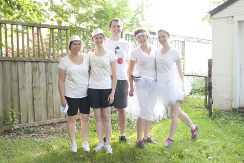
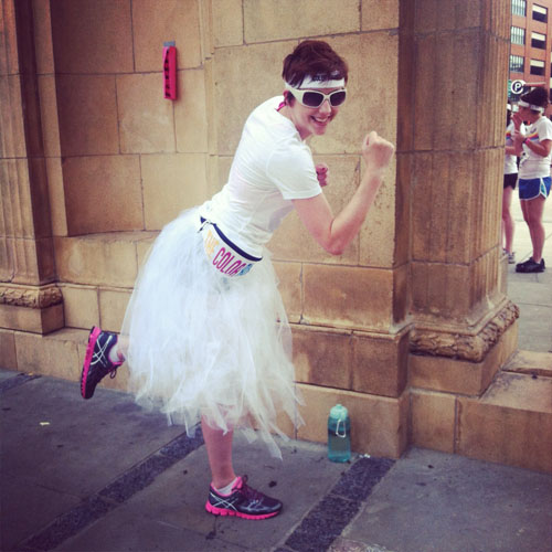
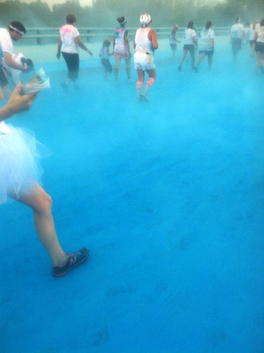
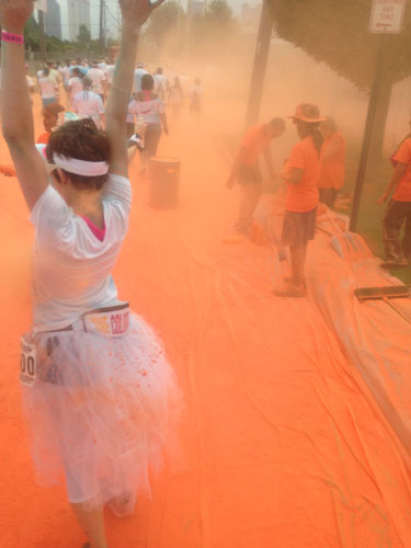
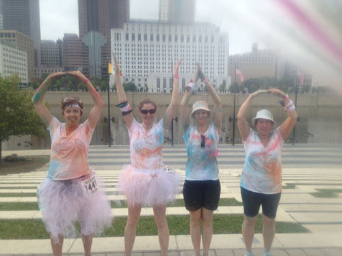
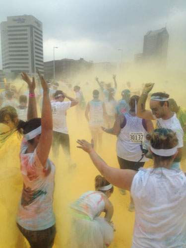
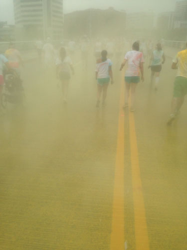
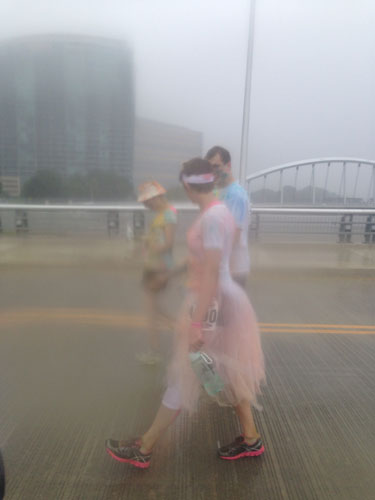
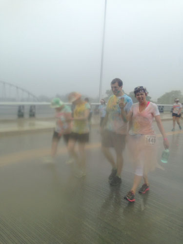
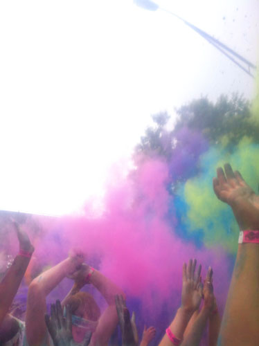
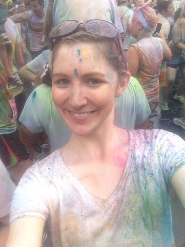
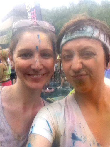
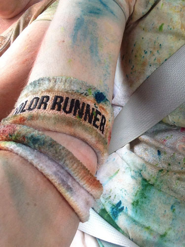
On Saturday, I did the Color Run with my friends Emily and Stephanie and Steph's husband and mom. I say "did" and not "ran" because it was pretty much impossible to run, given the enormous crowd—more than 10,000 people showed up. It. was. insane. And even though we got drenched in what I suspect was a full-on monsoon, it was a LOT of fun! Words really don't do it justice, so here are some pics that Emily and I took. (Emily's photos are tagged with a little asterisk beside them. Credit where credit is due, y'all.)

 *
*
 *
*
 *
*
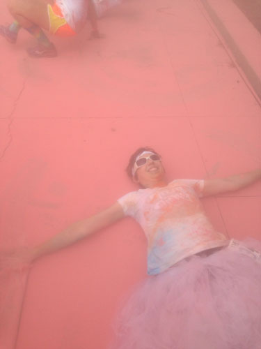
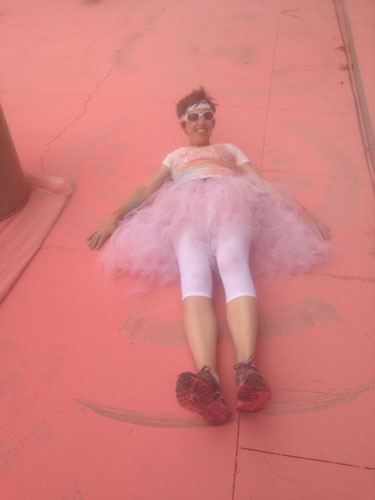
(Making "snow angels" in the color dust was kind of a thing. What's up double chin.)
 *
*
 *
*
 *
*
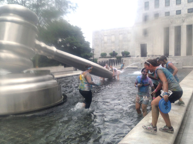
Aaaaaaand then the monsoon happened.
 *
*
 *
*
 *
*
 *
*
So we went for a swim.
 *
*
After the race, there was a DJ-dance-color party.

 *
*
(Isn't Emily just adorable?)
 *
*
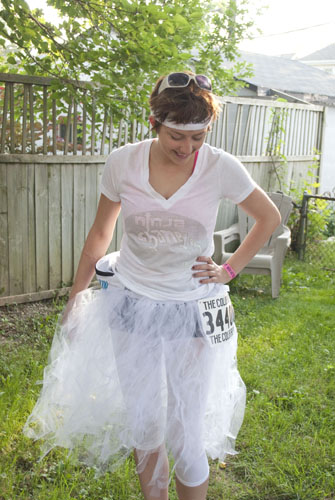
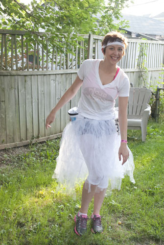
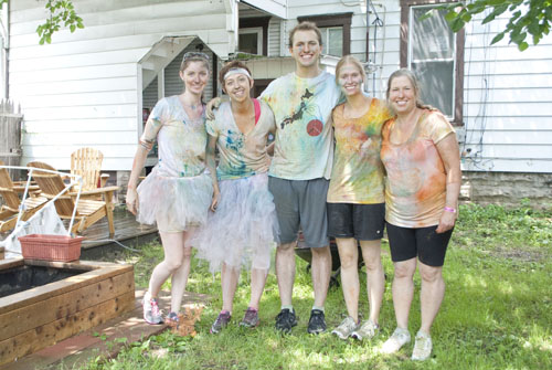 All in all, it was an incredible fun run/walk and we all had a blast, despite the rain. I'm already excited for next year! And for those who are wondering...the shots in my backyard were taken with my DSLR. The on-location photos were taken with our iPhones, which were kept safe in plastic ziploc bags. We had heard that the color (which is basically food-grade dyed cornstarch) has a tendency to ruin DSLR lenses and phones alike, so we took precautions. I did a couple neat editing tricks to kind of tone down the foggy, desaturated effect; I'll do a tutorial on that soon. Also keep your eyes peeled for a tutorial on how we made our tutus!
tank: secondhand
cami: Old Navy
skinnies: Forever 21
jelly shoes: Urban Outfitters
necklace: Etsy
lipstick: Mary Kay in Red
You guys, I absolutely hate moving. It's such a pain in the butt. All the painting, packing, cleaning...it drives me crazy. The only thing I actually like about moving is at the very end, when you get to unpack everything and do some hardcore nesting. I'm a big nester.
But as we draw closer to the end of the month, I find that I'm less and less able to ignore the inevitable. And as much as I desperately hope I'll wake up one morning to find that the moving fairy has packed up all our crap, I know that eventually Matt and I will have to do it ourselves. I suspect that much of this weekend will be dedicated to packing up. Le sigh.
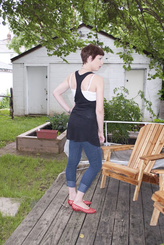
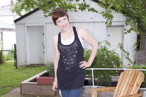
Ok, that's bumming me out. Let's talk about these photos. They're from the Fourth of July, and I completely forgot I had them. It was raining a bit, so I had to prop my camera up under our porch and shoot from there. I was having a hard time getting consistency from the flash, so one of the shots didn't come out quite as nicely as the others.
The Fourth was unseasonably cool, but no one was really complaining. I kind of liked that I was able to wear some rolled-up skinnies as the blue component of my red, white and blue outfit. And actually, I was pretty proud of this outfit. It was patriotic and festive without being too in-your-face...and the black shirt (which almost fits me like a dress) is one of my new favorite casual tops. So all in all...great success?
Ugh, sorry for the babbling. I'm trying to get back into the habit of getting up early and it's not going so well. I'd delete this whole thing and start over, but if I do I'll be late for work. Blergh.
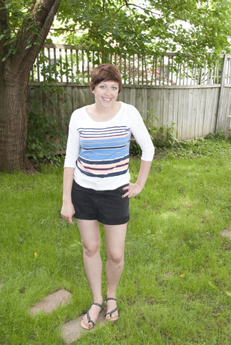
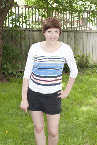
shirt: Old Navy
shorts: thrifted
sandals: Target
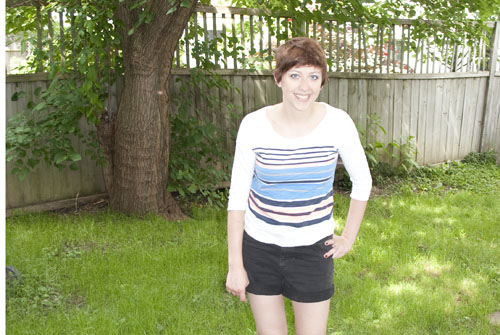
Hi folks. So I'm thinking that at least for the time being, you can expect a little photo-speak to accompany my outfit posts. Because half the time, I find the technique behind shooting an outfit more interesting than the outfit itself. Sorrynotsorry.
So I had Matt snap these for me quickly before we left for...uh...somewhere. For the life of me, I can't remember where I wore this. Oh well. Not important. I just turned the camera to auto and he clicked away. I love how even the auto-setting photos on this camera turn out so awesome!
The below shot is one I took just moments before we headed outside for the real photos. I had just gotten my remote and was going a little click-happy. I remember I didn't have time to set up my tripod and do a proper shoot, but I wanted to test the remote regardless, so I plopped the camera on my mantle and took a few snaps. This one turned out kind of cool, so I decided to post it. Dem collarbones. Girrrrrl...
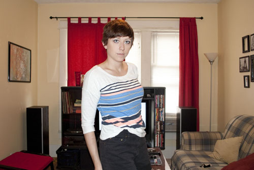 So this is where the cool photography part comes in. I noticed when I uploaded this photo that if I corrected the exposure to my face/clothes, the windows were completely blown out. But if I didn't adjust the exposure, I was too dark. I remembered reading this tip for fixing the problem, and used that as a guideline for doing my own version of a fix.
Basically, I made two copies of this photo. On the first, I adjusted the exposure to properly display my face/body. On the second, I adjusted the exposure the other way, underexposing everything to bring out the details of the blinds. Then I just used the Magic Wand tool in Photoshop to select the blinds and copied them to a new layer. I dragged the new layer to the correctly-exposed photo, lined it up over the blown-out windows, and adjusted the opacity down of the blinds-only layer to about 80 percent so it would look more natural. Looking back, I could probably have under-exposed the blinds even more in my initial steps, but for a first shot I say this isn't too bad!
So this is where the cool photography part comes in. I noticed when I uploaded this photo that if I corrected the exposure to my face/clothes, the windows were completely blown out. But if I didn't adjust the exposure, I was too dark. I remembered reading this tip for fixing the problem, and used that as a guideline for doing my own version of a fix.
Basically, I made two copies of this photo. On the first, I adjusted the exposure to properly display my face/body. On the second, I adjusted the exposure the other way, underexposing everything to bring out the details of the blinds. Then I just used the Magic Wand tool in Photoshop to select the blinds and copied them to a new layer. I dragged the new layer to the correctly-exposed photo, lined it up over the blown-out windows, and adjusted the opacity down of the blinds-only layer to about 80 percent so it would look more natural. Looking back, I could probably have under-exposed the blinds even more in my initial steps, but for a first shot I say this isn't too bad!
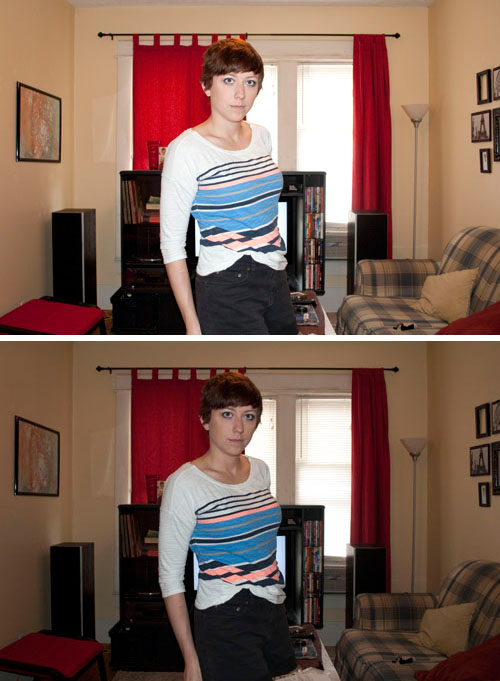
Top photo: Correctly exposed subject with blown-out windows
Bottom photo: Better-exposed windows with under-exposed subject.
So here's my question for you all: Would you be interested in reading tutorials on stuff like this? Or do you find that process a little dull and would rather read what I have to say about the styles/trends themselves? Or do you find both interesting?