
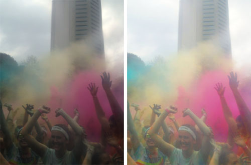
So. Here we go. For this tutorial, I'm working with a photo from the Color Run last weekend. Emily shot it with her iPhone (or maybe I did? I'm not sure), through a plastic bag. It was overcast, and the bag desaturated the color quite a bit, so it was a pretty dreary shot. Here's the before and after:
As a disclaimer, I'm using CS4 for my edits. If you're running a different version, commands might vary slightly...but it shouldn't be too off. Anyway. To start, I opened up the image (a JPEG) in Photoshop. The first thing I did (and the first think you should always do) is create a new layer of the original image with Command+J (or by right-clicking the layer in the Layers window and selecting "create duplicate layer"). That way, if you reeeeeeally screw something up, you always have the original handy.
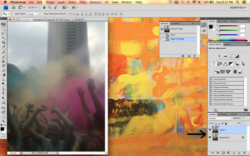
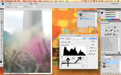
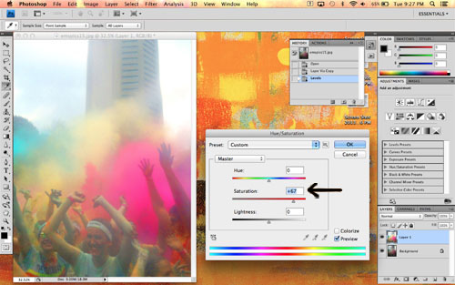
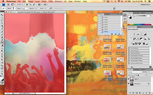
Next, I made sure the new duplicate layer was selected by clicking it in the Layers window. The selected layer is highlighted blue in the window, as you can see in the above photo. I opened the Levels editor (Command+L or Image>Adjustments>Levels in the menu bar) and tweaked those. I bumped up the white (the slider on the far right) a tad to brighten the whole image, then bumped up the midtones (the middle slider) quite a bit to adjust the grays in the image.
Next, I opened the Hue/Saturation editor (Command+U or Image>Adjustments>Hue/Saturation). I left the hue alone, but increased the saturation to brighten all the colors.
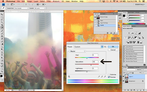
Be careful not to overdo it on the saturation here. We'll adjust the color clouds individually in a bit. If you go overboard on saturation, your skintones will look like this:
Next I used the Magic Wand tool (shown in the toolbar on the left, or just type "w" on your keyboard) to select the color clouds. Make sure you use the "add to selection" function along the top, so each click adds to the selected area instead of changing it. If the wand is grabbing too much space and selecting things you don't want, try adjusting the tolerance (also at the top) down a bit.
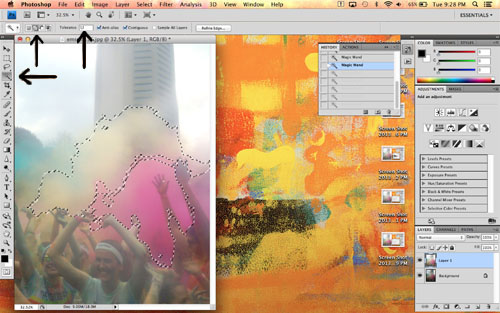
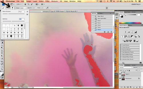
I selected all the color clouds, and realized that I had some of the peoples' hands/faces selected as well. De-selecting them with the Magic Wand would have taken forever, so I entered Quick Mask mode by clicking the circle-within-a-rectangle button on the bottom of the toolbar at the left. Quick Mask turns the not-selected areas of your photo red. You can then go in with an eraser and paintbrush to fine-tune your selection.
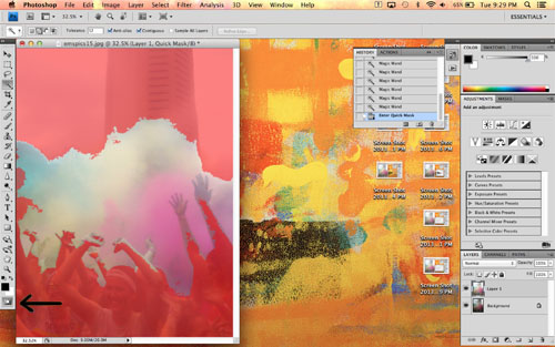
I adjusted the size of the eraser as needed using the drop-down menus at the top (you can also right-click to pull up the drop-down menus wherever your cursor is), and erased all the people out of my selection. I didn't worry too much about being perfect, because everything is so colorful a few little bits here and there wouldn't show up.
When I was done, my finished Quick Mask looked like this. See how only the color clouds are selected?
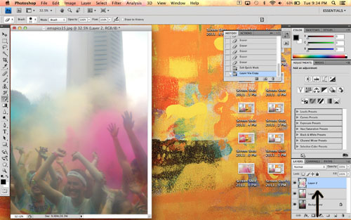
I turned off Quick Mask by clicking the same button again, and used Command+J to create a new layer that includes only the selected color clouds. You can see it in the Layers window here:
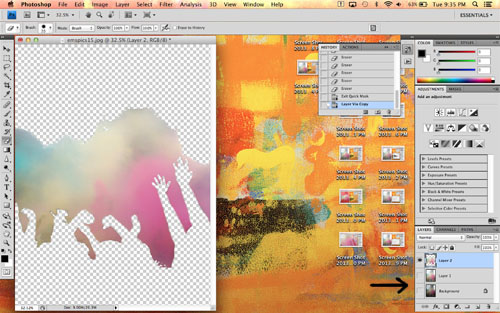
If you click the eyeballs next to each layer, you can hide them. I did that here to show you just the color-clouds-only layer:
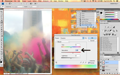
Then I un-hid the other layers and re-opened the Hue/Saturation editor. I bumped up the saturation on the color clouds layer even more so it would look the way it did at the actual run. (Okay, maybe the color is a little more intense. I couldn't help myself, hehe.)
Finally, to keep the image from looking too cartoonish, I adjusted the opacity of the color cloud layer. This helps to blend the rest of the edited layer and the color cloud layer by allowing a little of the edited layer to show through. I just adjusted the slider until it looked right.
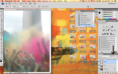
A note on layers: The order they appear in the Layers window is the order they're stacked in the viewer. So my original, unedited layer is at the bottom of the list and is therefore completely hidden, because the edited layer is overtop it with 100% opacity. The color cloud layer has a lower opacity, so although it covers the edited layer, a little bit is allowed to show through. Does that make sense?
So there you have it! A pretty easy process, despite all the words you see above ;)
Now, does all that make sense to you guys? Sometimes I'm pretty bad at explaining procedural things like that. Let me know what you thought of this tutorial in the comments, please and thank you!
Cool! Your explanation is lucid.
ReplyDeleteooh very cool! Now for all that precision, I need to get a mouse... LOL! I can imagine it being difficult on my track pad!
ReplyDeleteI don't usually reply to these because who knows whether anyone will see them, but for what it's worth...I used a trackpad for all this and it wasn't terrible. I'm curious to see if I can use a stylus (like the one for my iPhone) on my Macbook's trackpad. Hmm...
DeleteThis comment has been removed by a blog administrator.
ReplyDelete